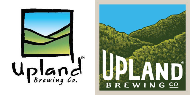
To better capture the quality of its beers and the company culture, Bloomington-based Upland Brewing Co. overhauled its identity, redesigning everything from marketing materials to tap handles.
“You don’t thrive and grow for 15 years by not making changes,” the company wrote on its blog.
To help coordinate the effort, Upland enlisted Indianapolis, IN.-based Young & Laramore, a full-service advertising agency that has worked with the likes of Pepsi and New Balance.
Young & Laramore forced the company to “articulate what was at the core of the Upland ethos and family,” the brewery said.
So what does Brewbound’s very own creative director, Matt Kennedy, think of the refresh?
The new look features hand-drawn lettering, helping Upland to dramatically improve the brand’s appearance without taking away from the company’s identity. The hills featured in the background of the company’s logo are still set in a square above the type, but now feature dimension and detail. Meanwhile, the improved typeface is more easily read and the quirky slope to the text feels more fitting and fun.
Above all, the redesign brings continuity throughout Upland’s entire brand, including new packages, beer labels, signage, marketing materials, collateral and even tap handles, which will help give the brand a personality on-premise.
Take a look at the complete rebranding effort below.

