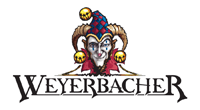
The introduction of a new company logo, a colorful one at that, coincides with the recent announcement that a $1.1 million expansion to the current brewing facility will add 7,500 square feet of new space.
According to a press release, the additional space will allow Weyerbacher to increase capacity up to 30,000 barrels. The build out is expected to be completed by October of this year.
Last year, sales for the company increased 34 percent, to the tune of $3.6 million. The brewer also shipped 9,729 barrels of beer in 2011, up from 6,982 in 2010. This growth is helping to fuel the expansion, one that could include a tasting room as early as 2013.
A New Look:

We asked the logo’s designer, Josh Lampe why Weyerbacher chose to focus on the Jester.
“As for the significance of the Jester, it’s been used as an icon of the brewery for a while and in going through the branding process we felt that continuing to use it as representative of the brewery fit well,” he said. “What came out of the discussions with key people at the brewery was that the brand itself is big, bold and not scared to take chances and that’s what we wanted to represent with the jester.”
Lampe said the jester will be used as the brewery icon, but not necessarily find its way onto all of the packaging.
The new designs are expected to hit retailers by June of this year. Additionally, the brewery is also rolling out a new west coast-style IPA to replace its Hops Infusion Ale.
“Significant amounts of hops are used for flavor and aroma while keeping the malt profile simple, allowing hops flavor to dominate and shine,” Head Brewer Chris Wilson said.