Holland, Mich. — New Holland Brewing is revealing a new look and feel in 2016 with a portfolio-wide packaging update, due to hit markets in March and continuing to roll out through spring and summer. The new design stays true to the corporate colors, brand characters, and label art that are synonymous with New Holland beer while making the shelf presence, readability, and overall impact much stronger.
“Craft beer is growing. We are growing. With nearly 20 years in the industry, to stand out on the shelf and reinforce our brand is paramount,” explained Joel Petersen, New Holland Brewing VP of Marketing. “We’ve incorporated many key elements in the new design that should help us achieve this goal and create a New Holland beacon. Walking around Great American Beer Fest last year and immediately recognizing our New Holland orange tent made me realize we need to do more to own our brand color in the market; this packaging brings that to life.”
The packaging overhaul is large in scale and includes bright orange crowns, redesigned labels, carriers, and mother boxes, all sporting a new, updated look that is designed to better reflect the outstanding quality of the beer in the bottle, as well as increase shelf presence and display impact. The presence of “New Holland Brewing” in name and orange color is also more prominent to help pull together a family of brands that has evolved and grown over the past 19 years.
Here’s what you’ll be seeing in the new packaging:
Highlighted Brand Art
Each New Holland brand features a name and art that inspires the beer and helps tell its story. This will not change. During the creative process, New Holland took a step back, evaluated the strength of their brand imagery, and moved in a direction to more clearly showcase the characters and visuals that makes each brand unique. This update allows the packaging to remain recognizable to long-time fans, as an ode to heritage, while better representing the future of the company brand.
Brighter Colors with Orange as a Beacon
Shop-ability on shelf is key. The new packaging features brightened colors and matching side and end panels. With both of these changes, the consumer can better spot the New Holland brands and learn about the beer no matter which way the carrier is displayed on shelf. The new designs will create a “billboard” effect where multiple brands are displayed. Bright orange crowns will top off all brands.
Reduced Text for Enhanced Readability
It comes down to simplicity: what is the beer style, flavor profile, and what flavors might it pair with? New Holland is committed to reducing the noise on the packaging and allowing the consumer to read the most important details.
“We worked with internal and external design partners – along with our wholesalers – to bring this new packaging to life,” continued Petersen. “We cannot wait to hear what New Holland consumers have to say about the look. It’s been a labor of love that we are excited to see on shelf.”
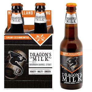
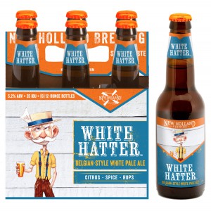
New Holland is committed to being as eco-conscious as possible and reducing the waste associated with a new packaging launch. They will roll out the new packaging as it makes sense with current packaging inventory. The first brands in new packaging – White Hatter, Belgian-style White Pale Ale, and Dragon’s Milk, Bourbon Barrel Stout – will hit shelves in March. The rest of the lineup will follow and be completed by the end of the summer.
About New Holland Brewing Co.
New Holland Brewing Company’s deep roots in the craft industry go back to 1997. Our role as an integral member of the artisan approach is something we take seriously, yet engage lightheartedly. We believe the art of craft lives in fostering rich experiences for our customers, through creating authentic beer, spirits and food while providing great service. Recognized for our creativity and artistry, our mission to improve the lives of craft consumers everywhere is seen in our diverse, balanced collection of beer and spirits.