
America’s oldest brewery is evolving to a more modern look.
D.G. Yuengling & Son today announced that, after three decades, it is updating the packaging for its Traditional Lager as well as Light Lager and Black & Tan porter brands.
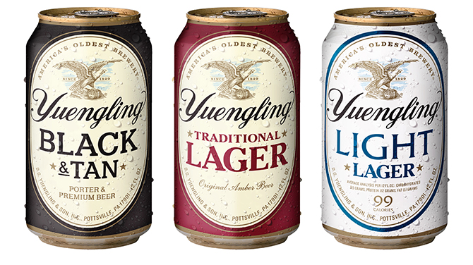
Despite a newer, more simplified look, the refreshed packaging maintains the feel of a heritage brand and prominently features the Pennsylvania brewery’s eagle and barrel icons while calling out its roots as “America’s oldest brewery.”
“We’ve improved the shelf pop with the elevated imagery that better communicates the authenticity and craftsmanship of America’s oldest brewery,” Yuengling director of marketing Tyler Simpson told Brewbound.
Highlighting the eagle and barrel symbols is a callback to Yuengling’s genesis in 1829 as the Eagle Brewery, Simpson added.

One of the goals of the redesign was to “better align our packaging across our three core brands,” Simpson said, and the new packaging does create a more unified shelf set. It also simplifies what was once crowded messaging on labels and packaging. It’s a case of addition by subtraction with a simplified message, color palette and font choices.
The woodcut-style design with an engraved-style of eagle will be a “powerful and distinct” differentiator from other packaging in the category, Simpson said.
“We are confident this will have an impact from sales perspective and an image and equity perspective as well,” he said. “This is really an opportunity for us to stand out from elevated image standpoint.”
Yuengling’s 99-calorie Light Lager brand also got a makeover. The new blue, cream and white color scheme for Light Lager is intended to reposition the beer as “a refreshing sessionable light beer alternative,” Simpson said. In the past, the brand had a much darker and heavier cream and red look.
“We think it better communicates the refreshing taste appeal of Light Lager,” Simpson said. “We’re super excited about that brand going forward.”
The new designs are Yuengling’s response to an increasingly crowded and competitive marketplace. Simpson said the company decided to evolve based on wholesaler and consumer feedback to “premiumize” and “clean up” the look of its products.
“That was one of our objectives: strengthen through simplification,” Simpson said. “In the past, we had so many different messages and elements on the packs. We thought there is power in simplifying.”
The rebranding effort, led by the brewery’s internal design team with support from Pennsylvania-based Bailey Brand Consulting, was more than a year in the making, Simpsons said.
“This is something that we championed ourselves,” he said. “The Yuengling family are firm believers in the upgrades we’re making.”

The new packaging is slated to hit store shelves next month with the launch of Yuengling’s beer in Indiana via Monarch Beverage, Indiana Beverage and Five Star Distributing. Other markets will begin receiving the new packages as retailers deplete their inventories, Simpsons said.
Simpson wouldn’t put a dollar figure on the rebranding effort, saying only that “a significant investment” was made to replace printing assets.
Yuengling ranked as the No. 1 craft brewery in U.S. last year, according to the Brewers Association. The company also grew dollar sales 7 percent in grocery, convenience and multi-outlet stores, according to market research firm IRI Worldwide. Its Traditional Lager offering finished the year up 7.4 percent, with dollar sales in excess of $295 million, and Light Lager ended the year up 6.2 percent with more than $54 million in sales, according to IRI.