South Africa’s only real spritzer made from wine with added flavours, has launched a new campaign capturing a refined, timeless aesthetic. This new era highlights effortless elegance—where real wine meets sparkling sophistication—and reintroduces the brand through a sensory ritual: Pop It, Swirl It, Breathe It In.
This ritual reflects the sensory experience tied to aroma, taste, and memory. It is designed to evoke moments of presence, grounding, and intentional living—reminding consumers of the beauty found in slowing down and appreciating meaningful experiences.
Celebrating the Sunset Aperitivo Moment.
The campaign draws inspiration from the sunset aperitivo occasion, a moment often associated with warmth, connection, and reflection. Sunset is described as a “golden hour” where life feels lighter and moments linger. Bernini positions this lifestyle space as one filled with long lunches, slow weekends, and the shimmer of possibility.
“There is a quiet but powerful shift happening in how South African women choose to live and experience their world,” shares Paigon Prince, Senior Brand Manager for Bernini South Africa
Prince explains that many people are seeking softer, slower, and more intentional experiences—spaces where authenticity thrives away from the pressure of an audience. According to Prince, Bernini aims to reflect that gentle shift, placing value on presence rather than performance.
A Sensory Ritual Rooted in Intentional Living
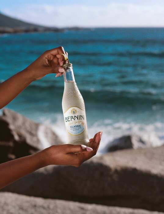
The Ritual of Real Wine introduces a three-step moment of pause:
Pop It – The sound of delicate bubbles hints at the experience ahead.
Swirl It – Releasing natural aromas of quality grape wine in the signature Bernini coupe glass.
Breathe It In – A moment of grounding and appreciation tied to real wine notes and sensory memory.
The range features three distinct styles made from real wine with flavours:
Classic – A white-style expression with subtle notes of honey
Blush – A rosé-style variant with soft floral character
Mimosa – A sparkling white option made with real orange juice
While these descriptions provide insight into the brand’s positioning, they are intended solely for informational purposes.
A Sophisticated New Look for a New Era
Alongside the campaign, Bernini debuts an elevated packaging refresh. The design incorporates:
A classic blue stripe expanding the brand’s premium appeal
The crown “B” emblem and signature Bernini blue, reinforcing brand identity
A transition to a flint glass bottle for the Classic variant, enhancing visibility and style
“As we evolved the brand, our intention wasn’t to make life louder, but to make it feel more meaningful. Because life becomes more beautiful when you pause long enough to savour it and Breathe It In.”
Prince explains the intent behind the update
For More Information:
Learn More
Stay Informed, Stay Competitive
Unlock the articles, expert interviews, and data reports that power the beer and beyond industry. Join our community and stay ahead with exclusive insights from Brewbound.