
Editor’s Note: Marty Butler is is the co-founder of The Butler Bros, an Austin-based branding, consulting and graphic design studio that has executed rebrands for craft breweries such as Maui Brewing Co. and Real Ale Brewing, and done work for companies such as Southwest Airlines and Tequila 512.
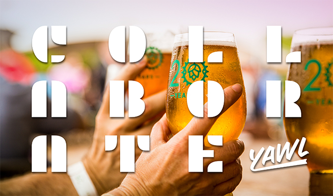
Founded in 2002, The Butler Bros approaches its work with the guiding principle of “radical collaboration,” which it describes as a process that allows for problem solving with, instead of for, clients.
In his column for Brewbound Voices, Butler, who also co-founded the Austin Home Brew Festival, describes his firm’s creative process while sharing lessons learned during recent branding projects with companies across the beer, spirits and food industries.
Every package on every shelf, whether it’s tequila, craft beer or chewing gum, was designed to convince a consumer that it is worthy. Consumer packaged goods (CPG) brands sit in an incredibly competitive environment. When they make the decision to update or redesign their branding or packaging, they desire to do so with a firm grasp on consumer and market insights, and often let those insights guide their decisions. Mature brands often commission exhaustive research that isn’t guaranteed to yield inspiring insights or sound strategy. Smaller brands often rely on the opinion of an owner or a graphic designer, and this can lead to decision-making based on personal preference with little or no strategy.
Our brand studio, The Butler Bros, repackages brands. We name or rename products and entire organizations. And we design packaging, identity systems and other core elements that brands need to tell their story. We use a number of practices to gather insights and develop a strategy before we start designing or writing. The guiding ethos of our studio is ‘radical collaboration’ — which is exactly what it sounds like. We embrace close collaboration with clients because we know we need them at least as much as they need us. This process requires an attitude that subjugates ego and replaces it with a desire to listen, learn, and — during the process — gain empathy and true understanding. Entrepreneurs, operators, consumers, designers, writers — everyone has a place at the table. We have confidence that the best ideas will rise in the end, regardless of who has them. We aspire to create branding with our clients rather than for them; the outcome proves to be less reliant on trends and more rooted in reality of a brand. And so the work is more likely to resonate and, more importantly, last.
If you really want radically different work, you have to work in a radically different way.
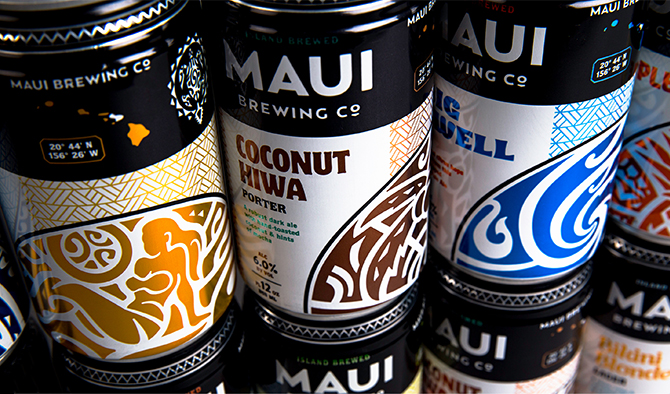
We were hired by Maui Brewing Co. to update their branding, packaging and to rename some of their beers. One of the core practices of our studio is to ‘Blitz.’ Imagine a room where a carefully selected group focuses intently on your brand for more than a day without checking their Instagram feeds. We use this practice, with drills from a design thinking framework, to fully understand the problem we are trying to solve. From there we can begin to catalog insights to inform creative development. It’s the beginning of our strategic work, but most importantly it is a highly collaborative effort and sets the tone for the relationship we have with a client. To learn more about design thinking and the practice of blitzing, read “Thinking Wrong,” authored by our partners at Future.

In a drill we used during the Maui Brewing Co. Blitz called ‘As Art,’ we asked each member of the brewery staff to bring an object that they believed exemplified the brand. One woman took the assignment quite seriously, fabricating a piece of art using beer cans to spell out the word ‘ohana, which means ‘family’ in Hawaiian. Indeed, the brewery has its own ‘ohana, and their customers are a part of it. Her contribution influenced our work and the word ‘ohana made it into the core design expression of the brand and the copy on every package. This insight informed our decision to make the new branding visually integrated, like a family; which in turn inspired us to use more credible signals from Hawaii like Maori tattoo art and Hawaiian language, rather than clichéd surfer images. Anyone can run this drill at any time. Ask your team members to bring in an object they think represents your brand and put them all on a table. Have everyone go around the room and explain why they brought what they did into the room. You’ll be amazed what people bring and why.
![]()
In another Blitz drill called the ‘KonMari Sort,’ named after the author Marie Kondo’s method, we asked the Maui Brewing Co. team to stand in front of a wall crowded with their existing brand assets and remove anything that didn’t bring them joy as they considered their new branding. This process allows our team to understand where the equity lives in the existing branding. After a while, one of the few remaining items on the wall was the brewery’s original honu (turtle) logo. The logo was tattooed on Garrett W. Marrero, the founder, and exemplifies deep meaning and symbolism. The identity was rendered in the Maori style, which is a sacred, native cultural expression that originated in Polynesian culture and can be found all through the Pacific islands. The logo inspired our team to use Maori tattoo art for each package.
The results of honoring culture and the founder’s vision? After the brand update, Maui Brewing Co. saw a 55 percent increase in sales in their home market from January 2016 to January 2017. So pivoting away from cliché and embracing the power of their Maui story and roots has paid dividends. Every beer brand has something original that can be amplified and something unique that can more be effectively owned. It’s often right under our noses.
For Outside-the-Box Inspiration: Get Out
To generate a branding strategy, we also conduct primary and secondary research to understand the marketplace. It is critical to record findings from the competitive landscape and to visit with both consumers and industry experts about a particular category or product. However, this is never a source of creativity for us, or how we realize a vision for the product. So we’ve embraced the practice of ‘Getting Out.’ Whether it’s visiting a local bar for a whiskey school or boarding a flight to Guadalajara to see a production facility, we like to get out in the world and actively search for insights and inspiration.
We were hired by Austin-based Tequila 512 (named after the local area code) to update their story, identity, and packaging. After conducting a day-long Blitz in Austin, the founder invited us to visit the distillery in Jalisco, Mexico. Before we left, we agreed that we wanted to design a brand that represented Austin, while also avoiding the traps that have been set for Austin brands, including live music, cowboy boots and blithely crafted script type.

Getting out in the town of Tequila revealed that Austin and Tequila had some commonality. Tequila’s businesses’ were adorned with hand-painted signage on the windows and walls of pharmacies, taco stands, and flower shops. Austin is also full of this kind of practical artwork. This discovery informed our decision to use a sign painting style on the packaging. Tequila brands hadn’t explored this visual territory, so we chose a high contrast, screen printed bottle that would catch the eye of the consumer on the shelves. We’re constantly searching for new visual territory that can help a brand stand out. Many tequila brands use paper labels, traditional imagery and a relatively serious tone to sell their juice. Everyone on our team recognized the opportunity to be bright and high contrast as a way to pivot away from the status quo tequila branding.

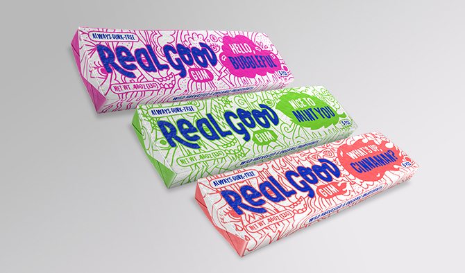
Sometimes you don’t need to travel to Mexico or Maui for inspiration. When startup Real Good Gum hired us to design their gum packaging, we took their founder, Edward Bradfield, through his very own Blitz. While using a drill called “Framer in Chief,” Edward described to our team the inspiration for his gum. We learned his daughter had started to have seizures and was prescribed a medication to help bring them under control. The treatment would stop her speech development, and the doctor told Edward that he should let her chew as much gum as she wanted to help keep her muscles and tongue strong. So he found himself standing in convenience stores reading gum labels—and what he found disturbed him. Petrochemicals, food dyes, artificial sweeteners, and flavors abound in conventional chewing gum—especially the stuff kids like. Edward was determined to create a gum product for his daughter and every other kid that wasn’t loaded with artificial ingredients and petrochemical spin-offs.
Our marketplace research revealed that most natural gums were designed to appeal to adults, so there was a huge gap in the market for a brand that would speak directly to kids. Even though parents would decide whether to purchase the product, kids needed to have a positive interaction with the packaging. This gap was an opportunity for the designers, but it also provided a chance to name the three flavors in a way that spoke directly to children. “Hello Bubbleful,” “Nice to Mint You” and “What’s Up Cinnaman” were born. We also knew that kids needed to have a product that didn’t scream healthy as much as ‘fun,’ and parents needed to get that the gum was a conscious alternative. We wrote the line, ‘Always Gunk Free’ and placed it on the front of every package as a light touch way of signaling better-for-you ingredients without spoiling the moment for kids. Whether it’s a picky eight year old gum chewer or a 42 year old craft beer fanatic, staying focused on the consumer when making branding decisions is critical.
Collaboration sits at the center of how we approach problem solving. We didn’t choose this way of working because it’s a trendy way to sell our services; we do it because it creates tangible results in the marketplace. There is no reason to update a brand if it doesn’t affect sales. Radical collaboration is a resource that is available to anyone at any time to start a branding change. Gather your people, get out, and turn down the volume on your ego to help open your mind to the inspiration that is all around us.
About Brewbound Voices:
Brewbound Voices was created with the goal of providing readers valuable insight into areas like finance, investment, branding, marketing, sales, and distribution. The column serves as an avenue for experts to contribute their knowledge to our readership. Interesting in writing for Brewbound Voices? Email pitches to [email protected].